
Branding · 21 Apr 2025 · AT Media™ Editorial
How to Make Your Brand Look Premium Online (Even on a Tight Budget)
Premium does not mean expensive ads. Learn the design, messaging and trust choices that make small businesses look established and credible.
Premium is a feeling — not a price tag. Many small and mid-size businesses look amateur online not because they lack budget, but because visual and messaging choices don't match the quality of their actual work.
Typography and spacing
One strong font pairing, generous whitespace and consistent heading sizes instantly elevate a site. Avoid cramming too many messages above the fold.
Photography over stock clichés
Real team photos, office shots and project screenshots beat generic handshake stock images. If you use stock, choose subtle, modern scenes — not over-smiled corporate actors.
Colour discipline
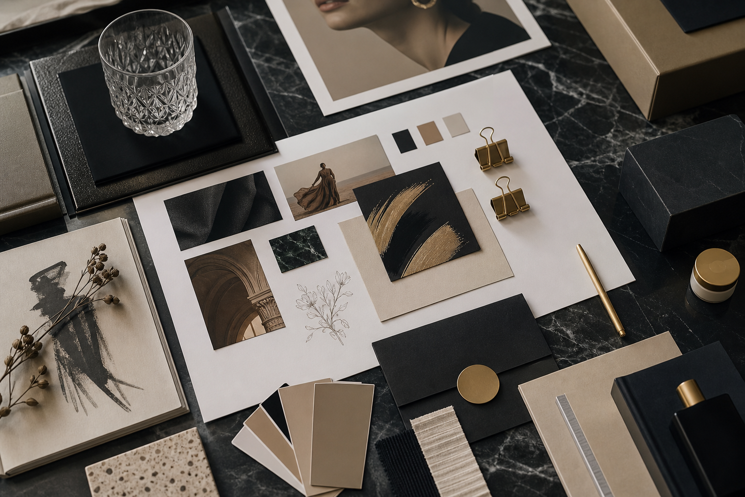
Pick a primary brand colour, one accent and neutrals. Premium brands restrict palette — they don't use six competing colours across buttons and banners.
Messaging clarity
Say who you help, what outcome you deliver and why trust you — in plain language. Buzzwords ("synergy," "cutting-edge solutions") erode credibility.
Social proof placement
Reviews, certifications and client logos near CTAs reduce hesitation. One strong testimonial with full name and context beats ten anonymous star ratings.
Website polish details
- Consistent button styles and hover states
- No broken links or "Lorem ipsum" anywhere
- Professional email domain (not free Gmail for business contact)
- Favicon and OG image that match your brand
Looking premium online is cumulative — small inconsistencies signal "small operation." Align design, copy and proof into one coherent story, and you'll outperform competitors with bigger ad budgets but messier presence.